

Common Properties
All chart types share these properties:Chart Configuration
Thechart_config object allows you to customize chart appearance and behavior:
Metric Properties
Each entry in a chart’smetrics list supports the following properties:
show_label is a per-metric override that controls labels for a single series, whereas chart_config.show_labels toggles labels for the whole chart. Use color to give an individual series a distinct color instead of the default theme palette.Number Charts
Number charts display a single metric value, often used for KPIs.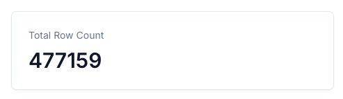
icon_variant.
Required properties for number metrics:
For detailed information, check the YAML reference.
Datazone currently uses Lucide version 0.515.0. If you try to use an icon introduced in a newer version, it may cause an error or not display correctly. See the Lucide icon gallery for available icons in 0.515.0.
Composed Charts
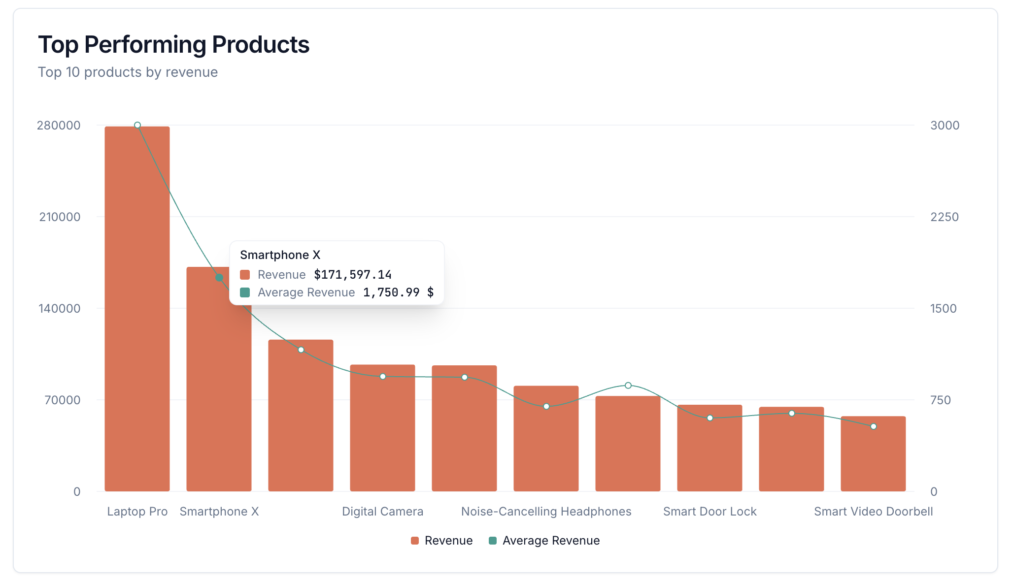
Composed charts allow you to combine line and bar series in a single chart, each mapped to a specific axis. Use theaxis property to define axes, and set axis_name and composed_type for each metric.
Line Charts
Line charts visualize trends over time or continuous data. You can use theaxis property to define multiple axes and assign metrics to them using axis_name. Use fill_area to control whether the area under the line is filled.
Line Chart Configuration
Bar Charts
Bar charts compare values across categories. You can use theaffected_filter attribute under a dimension to allow users to update a filter by clicking a bar.
Standard Bar Charts
Dynamic Charts with Chart Inputs
You can add interactive controls directly to charts usingchart_inputs. This allows users to modify queries dynamically using dropdown menus without leaving the chart view.
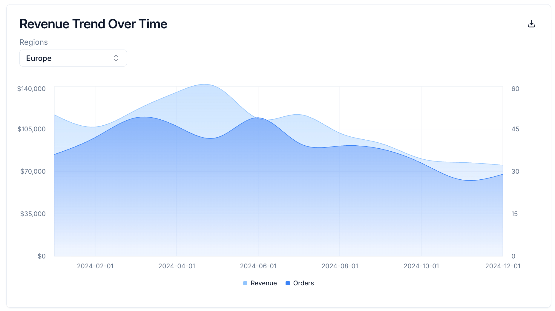
Chart Input Properties
Dynamic Chart Input Options
Chart inputs can fetch their dropdown options dynamically from database queries, enabling data-driven dropdowns and cascading input scenarios. This is particularly useful when:- Filter-Dependent Options: You want the available options to change based on active tab-level filters
- Cascading Inputs: One input’s value should affect another input’s available options
- Data-Driven Dropdowns: Options need to come from your database rather than being hard-coded
- User selects a country from the first dropdown (static options)
- The second dropdown automatically fetches regions for the selected country
- The
options_queryhas access to thecountryvariable from the first input
start_date filter value.
You cannot define both
options and options_query for the same chart input. The options_query can reference both tab-level filter variables and other chart input values using Jinja template syntax.Stacked Bar Charts
Stacked bar charts allow you to show multiple metrics stacked on top of each other for each category. Use thechart_config.stacked property to enable stacking:
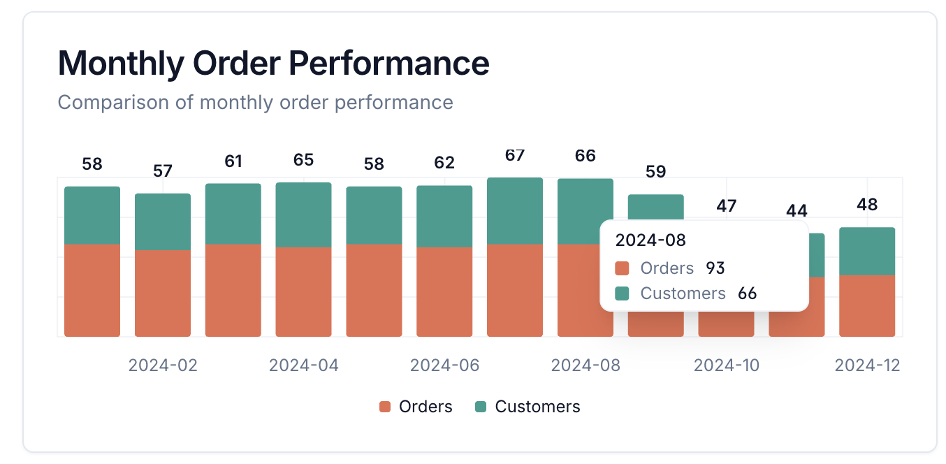
Chart Configuration for Bar Charts
Vertical Layout Bar Charts
You can create vertical layout bar charts by settinglayout: vertical in the chart configuration:
Pie Charts
Pie charts show part-to-whole relationships. You can use theaffected_filter attribute under a dimension to allow users to update a filter by clicking a pie slice.
Donut Charts
You can create donut charts by settingfill_donut: false in the chart configuration:
Radial Charts
Radial charts display progress or completion metrics in a circular format. They require exactly two metrics: the first metric represents the current value (displayed with a label), and the second metric represents the total or maximum value.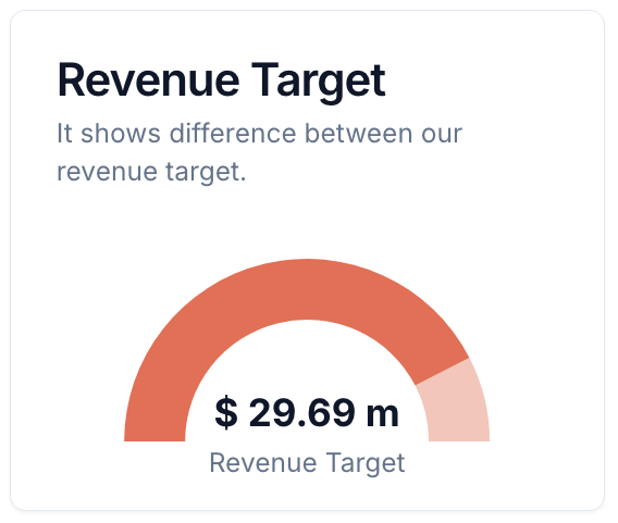
Table Charts
Table charts display raw data in tabular format.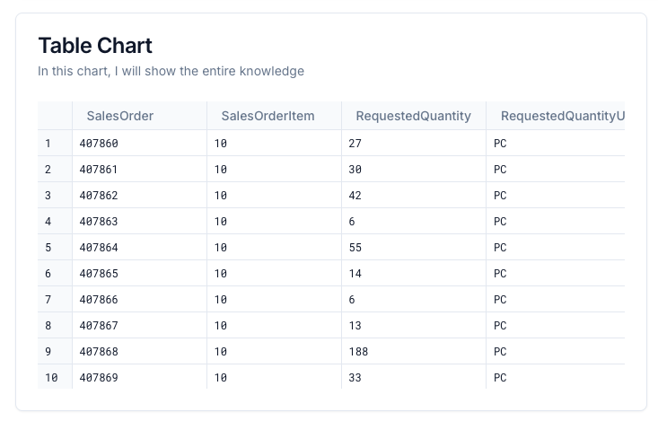
Data Table Charts
Data Table charts provide advanced tabular display with custom formatting and alignment for each column.- Sorting: Users can click on column headers to sort the table by any dimension or metric, ascending or descending.
- Pagination: Large result sets are automatically split into pages, allowing users to navigate through data efficiently.
data_table ideal for exploring large datasets interactively within your Intelligent App.
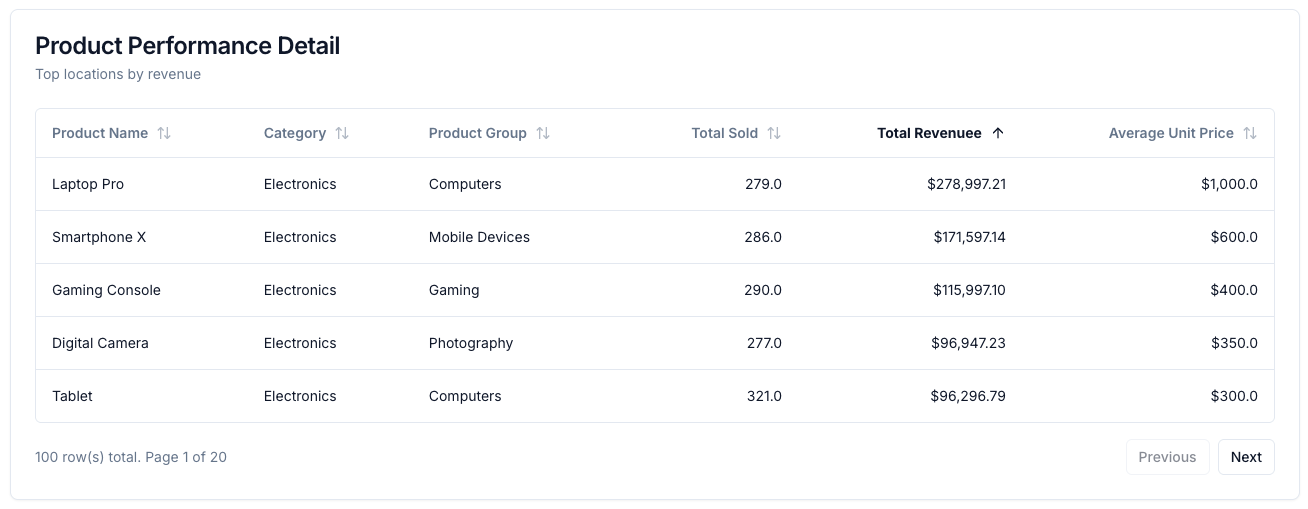
Chart Config
Chart configuration options allow you to customize the appearance and behavior of your charts. Common properties include:page_size: (Fordata_table) Number of rows per page
Formatting
Use theformat attribute under each metric to control how numbers are displayed:
Dimensions
Heatmap Charts
Heatmap charts visualize data where individual values are represented as colors. They require exactly two dimensions and one metric. Heatmaps are ideal for showing relationships between two categorical dimensions with a numeric value determining the color intensity.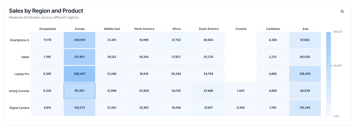
Scatter Plot Charts
Scatter plot charts visualize the relationship between two numerical variables. Each point represents a data record, positioned according to the values of two metrics on the x and y axes. Scatter plots are ideal for identifying correlations, patterns, or outliers in your data.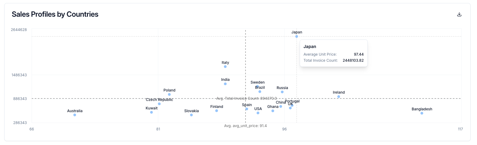
Scatter plots require exactly one dimension and two to three metrics. The first metric is plotted on the x-axis, the second metric on the y-axis, and an optional third metric can be used for additional visualization properties.
Advanced Features
Multi-Series Charts
For line and bar charts, you can include multiple metrics:Text (Markdown)
Render rich text using Markdown in your Intelligent App.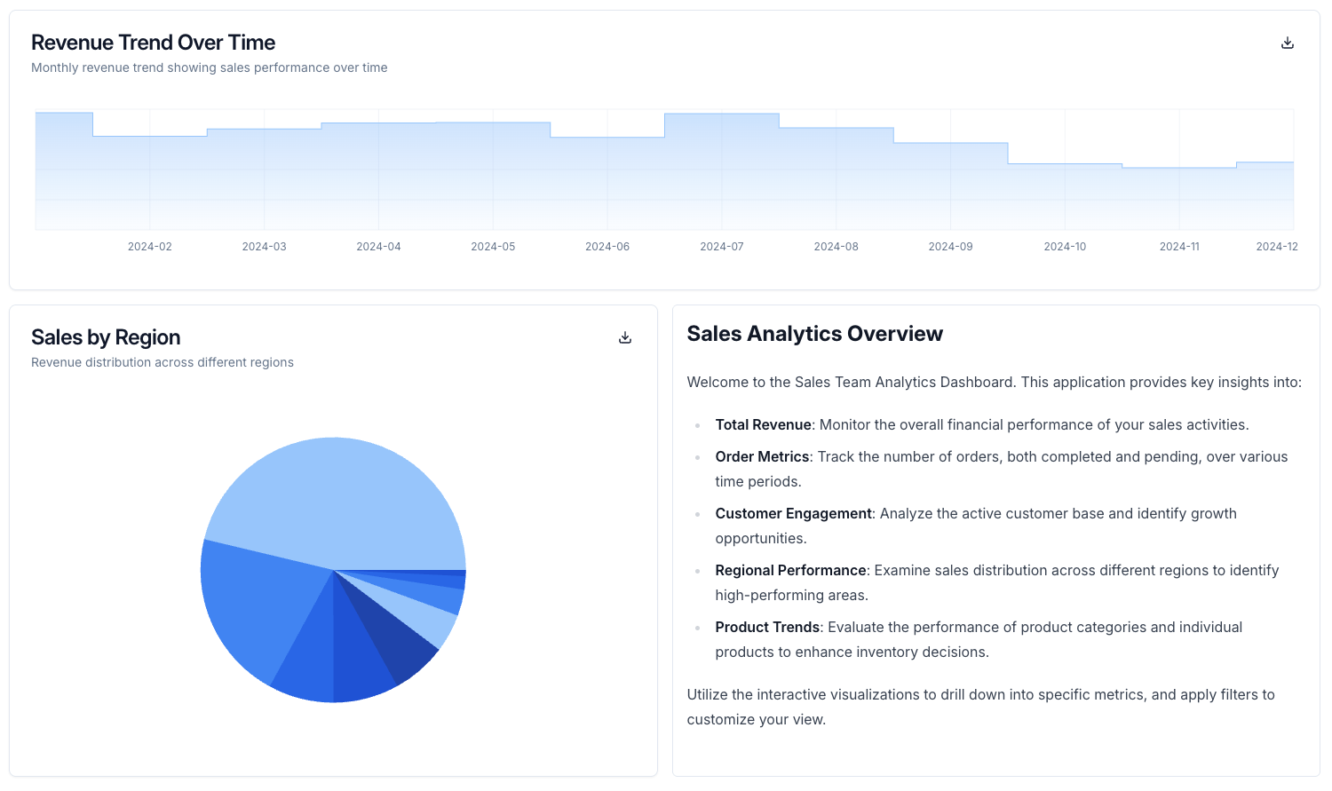
Item List
List-style chart for items (orders, activity): icon, title, description, optional timestamp and badge; opens detail modal on click.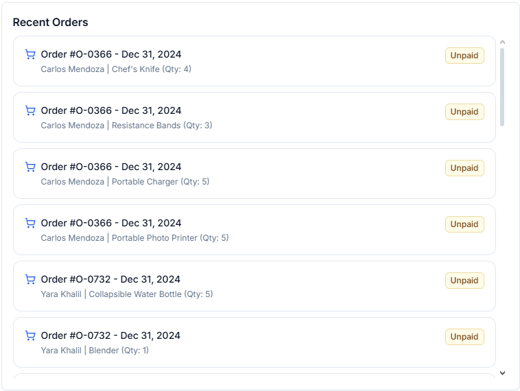
Widgets
When none of the chart types above fit, render your own React component in the app grid with a widget. Widgets are TSX components that Datazone compiles in the browser at runtime, placed in the layout withtype: widget. Attach a SQL query and its rows arrive as the component’s data prop.
height is set. Widgets can also be nested inside a chart-group, next to charts.
title and description are metadata on the definition — no header is rendered for you. Your component owns its entire visual output, so render the heading yourself.Source Types
Withsource_type: inline (the default) the component code lives in the app YAML under source. With source_type: file it lives in a .tsx file in your project repository, referenced by a path relative to the repository root and read when the app is loaded.
Component Contract
Your source mustexport default a React component. Datazone passes it two props:
setFilter makes widgets interactive participants in the app rather than display surfaces: a click inside your component can drive every chart and filter, the same way affected_filter does for bar and pie charts.
Available Imports
The widget runtime resolves a fixed set of imports — anything else fails to compile.Styling
SDK components inherit the active theme automatically, soCard and friends match the rest of the dashboard, including custom themes. For your own styling, prefer inline style objects: utility classes are resolved from the platform’s precompiled stylesheet, so a class the platform itself never uses may not exist at runtime.
Theme CSS variables come in two shapes, and mixing them up produces an invalid color:
--primary and --ring are redefined by the color themes, so their shape depends on the active theme. Use --chart-1 … --chart-5 for a theme-following accent, and the semantic variables above for text, borders, and status colors.Widget Queries
A widget’squery behaves like a chart query: Jinja templating with the app’s current filter variables (use the same {% if ... is defined %} guards), cached per the app’s cache and cache_ttl config, re-run whenever a filter changes, and restricted to SELECT statements executed with the permissions of the user viewing the app.
query never hits the database — use that for purely presentational widgets, or ones that only react to appContext.
Widget queries read tab-level filter variables only. Chart inputs are a chart-level feature and are not available to widgets — render your own controls with React state instead.
Validation and Errors
At load time, the app definition is rejected — with an error naming the widget — when a layout item references a widget that is not defined incomponents.widgets, when the source / file rules above are broken, or when a file widget points at a path that does not exist in the repository.
At render time, compile and runtime errors appear as an inline message in the widget’s slot. A broken widget only breaks itself; the surrounding tab, charts, and filters keep working.
For full attributes and layout usage, see the YAML Reference: Widgets.