> ## Documentation Index
> Fetch the complete documentation index at: https://docs.datazone.co/llms.txt
> Use this file to discover all available pages before exploring further.
# YAML Reference
> Comprehensive reference for all YAML attributes in Intelligent App definitions.
# Intelligent App YAML Reference
This page provides a detailed reference for all attributes available in Intelligent App YAML definitions. Use this as a guide when authoring or reviewing your app configuration files.
## Top-Level Structure
```yaml theme={null}
app:
name: string # App display name
description: string # App description
icon: string # (Optional) App icon (Lucide icon name)
config: # App configuration (see below)
layout: # Layout definition (see below)
components: # App components (see below)
```
***
## `config` Section
| Attribute | Type | Description |
| --------------------------- | ------ | --------------------------------------------------------------------------- |
| `cache` | bool | Enable/disable caching of query results (default: true) |
| `cache_ttl` | int | Cache time-to-live in seconds (default: 3600) |
| `hide_llm` | bool | (Optional) Hide the LLM assistant (Orion AI) in the app UI (default: false) |
| `hide_insights` | bool | (Optional) Hide the Insights panel in the app UI (default: false) |
| `hide_filters` | bool | (Optional) Hide the filters panel in the app UI (default: false) |
| `hide_header` | bool | (Optional) Hide the app header in the UI (default: false) |
| `chart_export_enabled` | bool | (Optional) Enable export functionality for charts (default: false) |
| `llm_instruction` | string | (Optional) Custom instruction for the LLM (prompt customization) |
| `insight_agent_instruction` | string | (Optional) Custom instruction for the insights agent |
| `style` | object | (Optional) Custom styling configuration (see below) |
### Style Configuration
| Attribute | Type | Description |
| ------------------------- | ------ | ---------------------------------------------------------------------------- |
| `theme` | string | UI theme color scheme (default: "default") |
| `custom_style_attributes` | object | (Optional) Custom CSS variables for advanced theme customization (see below) |
Available themes: "default", "teal", "blue", "green", "purple", "orange", "amber", "mono"
#### Custom Style Attributes
You can override theme colors using Tailwind CSS variables in HSL format. This allows fine-grained control over your app's appearance:
```yaml theme={null}
style:
theme: blue
custom_style_attributes:
"--background": "220.0000 23.0769% 94.9020%"
"--foreground": "233.7931 16.0221% 35.4902%"
"--chart-1": "266.0440 85.0467% 58.0392%"
"--chart-2": "197.0667 96.5665% 45.6863%"
"--chart-3": "109.2308 57.6355% 39.8039%"
"--chart-4": "21.9753 99.1837% 51.9608%"
"--chart-5": "10.8000 58.8235% 66.6667%"
```
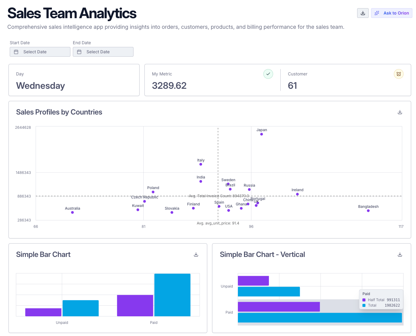 Common customizable CSS variables:
| Variable | Description |
| ------------------------------- | ---------------------- |
| `--background` | Main background color |
| `--foreground` | Main text color |
| `--chart-1` through `--chart-5` | Chart color palette |
| `--primary` | Primary accent color |
| `--secondary` | Secondary accent color |
| `--muted` | Muted background color |
| `--accent` | Accent color |
Colors must be specified in HSL format without the `hsl()` wrapper (e.g., "220 23% 95%" instead of "hsl(220, 23%, 95%)").
***
## `layout` Section
Defines the structure of the app (tabs, items, chart groups).
```yaml theme={null}
layout:
tabs:
- name: string # Tab identifier
title: string # Tab display title
filters: [string] # (Optional) List of filter names
items: # List of layout items (see below)
```
### Layout Items
| Attribute | Type | Description |
| ---------- | ------ | --------------------------------------- |
| `type` | string | `chart`, `chart-group`, `text`, `table` |
| `name` | string | Unique item name |
| `span` | int | (Optional) Grid span (width) |
| `height` | int | (Optional) Height in px |
| `entities` | list | (For `chart-group`) Nested layout items |
***
## `components` Section
Holds the main building blocks: charts, variables, filters.
### Charts
```yaml theme={null}
charts:
- type: string # `number`, `radial`, `line`, `bar`, `vertical_bar`, `pie`, `table`, `data_table`, `item_list`, `composed`, `heatmap`, `scatter`, `custom`
name: string # Unique chart name
title: string # Chart title
description: string # (Optional) Description
query: string # SQL query (Jinja supported)
chart_inputs: # (Optional) Interactive controls for dynamic queries
- type: string # Input type: "dropdown"
name: string # Variable name accessible in query via Jinja
label: string # Display label
default: string # Default selected value
options: [string] # (Optional) List of static options for dropdown
options_query: string # (Optional) SQL query to fetch dynamic options (cannot be used with 'options')
axis: # (Optional, for line, bar, vertical_bar, composed, heatmap)
- name: string # Axis name (e.g., left, right)
position: string # (Optional) Axis position: left, right, top, bottom (default: left)
format: string # (Optional) Number format for this axis
hidden: bool # (Optional) Whether to hide this axis
dimensions: # (Optional) List of dimensions
- name: string
label: string
number_format: string # (Optional) Number format for numeric dimensions
table_align: left|right # (Optional) Table alignment for this dimension
affected_filter: string # (Optional, bar/pie only) Filter to update when this dimension is clicked
metrics: # (Optional) List of metrics
- name: string
label: string
format: string # (Optional) Number format string
icon: string # (Optional, number/radial charts only) Lucide icon name (see https://lucide.dev/icons/)
icon_variant: string # (Optional, number/radial charts only) One of: "default", "neutral", "success", "warning", "error"
axis_name: string # (Optional, for line, bar, vertical_bar, composed) Axis to use for this metric
composed_type: string # (Optional, for composed) "line" or "bar"
submetric_name: string # (Optional, number/radial charts only) Name of the submetric to display
submetric_type: string # (Optional, number/radial charts only) Type of submetric display: "plain", "change", "delta"
color: string # (Optional) Custom color for this metric's series (e.g., hex code or Tailwind color)
show_label: bool # (Optional) Whether to show the data label for this metric
pivot_by: [string] # (Optional) List of columns to pivot by
show_labels: bool # (Optional, default: true)
chart_config: # (Optional) Chart configuration
show_legend: bool # (Optional) Whether to show the chart legend (default: false)
show_labels: bool # (Optional) Whether to show labels on the chart (default: false)
fill_donut: bool # (Optional, pie charts only) Whether to fill the donut chart (default: false)
is_stacked: bool # (Optional, pie/bar/vertical_bar charts) Whether to stack elements (default: false)
line_type: string # (Optional, line/composed charts) "linear", "monotone", "step", "natural"
fill_area: bool # (Optional, line charts only) Whether to fill the area under the line
custom_chart_type: str # (Optional, custom charts only) Custom chart type identifier
sub_expression: string # (Optional, number/radial charts) Sub-expression for metric calculation
page_size: int # (Optional, data_table charts) Number of rows per page
layout: string # (Optional, bar/vertical_bar charts) "horizontal" or "vertical"
hide_expression: string # (Optional, all chart types) JavaScript expression to conditionally hide the chart based on data
```
#### Composed Chart Example
```yaml theme={null}
- type: composed
name: top_products_composed
title: Top Performing Products
description: Top 10 products by revenue
query: |
SELECT
ProductName as product,
SUM(OrderLineTotalAmount) as revenue,
AVG(OrderLineTotalAmount) as avg_revenue
FROM consolidated_sales_df_299ceb
WHERE 1=1
{% if region_filter is defined %}
AND CustomerRegion = '{{ region_filter }}'
{% endif %}
{% if product_group_filter is defined %}
AND ProductGroup = '{{ product_group_filter }}'
{% endif %}
GROUP BY ProductName
ORDER BY revenue DESC
LIMIT 10;
axis:
- name: left
- name: right
position: right
dimensions:
- name: product
label: Product
metrics:
- name: revenue
label: Revenue
axis_name: "left"
composed_type: "bar"
format: "$0,0.00"
- name: avg_revenue
label: "Average Revenue"
axis_name: "right"
composed_type: "line"
format: "0,0[.]00 $"
```
#### Example: Bar Chart with Click-to-Filter
```yaml theme={null}
type: bar
name: sales_by_country
title: Sales by Country
query: SELECT country, sum(amount) as total FROM sales GROUP BY country
axis:
- name: left
dimensions:
- name: country
label: Country
affected_filter: country_filter
metrics:
- name: total
label: Total Sales
```
#### Example: Dynamic Chart with Chart Inputs
Chart inputs allow users to modify the query dynamically using interactive controls like dropdowns.
##### Static Options
```yaml theme={null}
type: bar
name: top_by_revenue
title: Top 10 by Revenue
chart_inputs:
- type: dropdown
name: group_by_column
label: Group By
default: Product
options:
- Product
- Customer
query: |
SELECT
{% if group_by_column == 'Product' %}
ProductName as group,
{% else %}
CustomerName as group,
{% endif %}
SUM(OrderLineTotalAmount) as revenue
FROM consolidated_sales_df
WHERE 1=1
{% if date_from is defined %}
AND OrderDate >= '{{ date_from }}'
{% endif %}
{% if date_to is defined %}
AND OrderDate <= '{{ date_to }}'
{% endif %}
{% if region_filter is defined and region_filter != 'all' %}
AND CustomerRegion = '{{ region_filter }}'
{% endif %}
{% if group_by_column == 'Product' %}
GROUP BY ProductName
{% else %}
GROUP BY CustomerName
{% endif %}
ORDER BY revenue DESC
LIMIT 10
axis:
- name: left
format: "$0,0"
dimensions:
- name: group
label: Group
metrics:
- name: revenue
label: Revenue
format: "$0,0.00"
axis_name: left
```
##### Dynamic Options
Chart inputs can also fetch their dropdown options dynamically from database queries. This enables data-driven dropdowns and cascading input scenarios where one input's value affects another input's options.
```yaml theme={null}
type: bar
name: sales_by_region
title: Sales by Region
chart_inputs:
- type: dropdown
name: country
label: Select Country
default: USA
options:
- USA
- Canada
- UK
- type: dropdown
name: region
label: Select Region
options_query: "SELECT DISTINCT region FROM sales_data WHERE country = '{{ country }}' ORDER BY region"
query: |
SELECT
region,
SUM(amount) as total_sales
FROM sales_data
WHERE country = '{{ country }}'
AND region = '{{ region }}'
GROUP BY region
dimensions:
- name: region
label: Region
metrics:
- name: total_sales
label: Total Sales
format: "$0,0.00"
```
Chart inputs work with all chart types and seamlessly integrate with Jinja templating, allowing you to create highly dynamic and interactive visualizations.
**Key Features:**
* **Filter-Dependent Options**: Chart input options can change based on active tab-level filters
* **Cascading Inputs**: One input's value can affect another input's available options
* **Template Variables**: Use both tab-level filters and other chart input values in your `options_query`
You cannot define both `options` and `options_query` for the same chart input. Use `options` for static lists and `options_query` for dynamic, data-driven dropdowns.
#### Example: Pie Chart with Click-to-Filter
```yaml theme={null}
type: pie
name: sales_distribution
title: Sales Distribution
query: SELECT category, sum(amount) as total FROM sales GROUP BY category
dimensions:
- name: category
label: Category
affected_filter: category_filter
metrics:
- name: total
label: Total Sales
```
#### Example: Heatmap Chart
```yaml theme={null}
type: heatmap
name: sales_heatmap
title: Sales Heatmap by Region and Product
query: |
SELECT region, product, sum(amount) as total
FROM sales
GROUP BY region, product
dimensions:
- name: region
label: Region
- name: product
label: Product
metrics:
- name: total
label: Total Sales
format: "$0,0.00"
```
Heatmap charts require exactly 2 dimensions and at least 1 metric.
#### Example: Conditional Chart Visibility
You can conditionally hide charts based on the query result data using `hide_expression`. The expression receives the data array and should return `true` to hide the chart:
```yaml theme={null}
type: bar
name: sales_by_category
title: Sales by Category
query: SELECT category, sum(amount) as total FROM sales GROUP BY category
dimensions:
- name: category
label: Category
metrics:
- name: total
label: Total Sales
chart_config:
hide_expression: "(data) => {return data.length < 5}"
```
In this example, the chart will only be displayed if the query returns 5 or more rows. This is useful for hiding charts when there's insufficient data to display meaningfully.
The `hide_expression` is a JavaScript function that receives the `data` parameter (an array of query results) and must return a boolean value. Return `true` to hide the chart, or `false` to show it.
#### Example: Scatter Plot Chart
```yaml theme={null}
type: scatter
name: example_scatter_chart
title: Sales Profiles by Countries
query: |
SELECT
CustomerCountry,
ROUND(AVG(UnitPrice), 2) as avg_unit_price,
ROUND(SUM(InvoiceTotalAmount), 2) as total_invoice_count
FROM consolidated_sales_df_9cb4a3
GROUP BY CustomerCountry
ORDER BY total_invoice_count DESC
LIMIT 20;
dimensions:
- name: CustomerCountry
label: "Country"
metrics:
- name: avg_unit_price
label: Average Unit Price
- name: total_invoice_count
label: Total Invoice Count
chart_config:
show_labels: true
```
Scatter plot charts require exactly 1 dimension and 2-3 metrics. The first metric is plotted on the x-axis, the second metric on the y-axis, and an optional third metric can be used for additional visualization properties.
#### Example: Custom Chart
```yaml theme={null}
type: custom
name: custom_visualization
title: Custom Visualization
query: SELECT * FROM custom_data
chart_config:
custom_chart_type: my_custom_chart
```
### Variables
```yaml theme={null}
variables:
- name: string # Variable name
type: string # `string`, `integer`, `float`, `boolean`, `date`
```
### Filters
```yaml theme={null}
filters:
- type: string # `text`, `number`, `dropdown`, `date`
name: string # Filter name
title: string # Display label
affected_variable: str # Variable updated
default_value: any # (Optional) Default value
multiple: bool # (Optional, dropdown only) Enable multi-select (default: false)
options: # (For dropdown)
type: string # `static` or `sql`
values: # (For static)
- value: string
label: string
query: string # (For sql)
use_input: bool # (Optional, sql only) Pass the dropdown's search text to the query as `search_term` (default: false)
placeholder: string # (Optional)
```
### Texts
Markdown text components allow adding rich textual content to your apps.
```yaml theme={null}
texts:
- name: string # Unique text component name
title: string # (Optional) Display title
content: string # Markdown content (supports GFM and fenced code blocks)
```
Layout usage with a text item:
```yaml theme={null}
layout:
tabs:
- name: overview
title: Overview
items:
- type: text # Layout item type must be 'text'
name: overview_md # References a component from components.texts
span: 12 # (Optional) Grid span 1–12
height: 240 # (Optional) Height in px; enables scroll when set
```
Text layout item properties:
| Attribute | Type | Description |
| --------- | ------ | ------------------------------------------------------------- |
| `type` | string | Must be `text` |
| `name` | string | References a component from `components.texts` |
| `span` | int | (Optional) Grid span (width) |
| `height` | int | (Optional) Height in px; when set, content becomes scrollable |
### Item Lists
List-style chart type. Each row supports icon, title, description, optional timestamp, and badge.
**Query result fields:**
| Field | Type | Description |
| --------------- | ------ | ------------------------------------------------------------------ |
| `icon` | string | (Optional) Lucide icon name (default: `Mail`) |
| `icon_color` | string | (Optional) Tailwind color class (default: `text-blue-600`) |
| `title` | string | Primary title |
| `description` | string | Secondary text |
| `timestamp` | string | (Optional) Right-aligned timestamp |
| `badge_text` | string | (Optional) Badge label |
| `badge_variant` | string | (Optional) Badge variant: `neutral`, `success`, `warning`, `error` |
```yaml theme={null}
charts:
- type: item_list
name: my_item_list
title: "Items"
query: |
SELECT
icon, -- e.g., 'Mail'
icon_color, -- e.g., 'text-blue-600'
title,
description,
updated_at AS timestamp,
status AS badge_text,
CASE
WHEN status = 'Success' THEN 'success'
WHEN status = 'Pending' THEN 'warning'
WHEN status = 'Error' THEN 'error'
ELSE 'neutral'
END AS badge_variant
FROM my_items
ORDER BY updated_at DESC
LIMIT 20;
```
***
Example:
```yaml theme={null}
config:
cache: true
cache_ttl: 3600
llm_instruction: "You are a helpful assistant."
hide_filters: false
hide_header: false
chart_export_enabled: true
style:
theme: "teal"
```
***
## Example
```yaml theme={null}
app:
name: Billing Collection Dashboard
description: Dashboard showing billing and collection metrics
config:
cache: true
cache_ttl: 3600
chart_export_enabled: true
style:
theme: "blue"
layout:
tabs:
- name: billing_data
title: Billing Data
filters: [product_group, membership_type_filter]
items:
- type: chart-group
name: kpis
span: 12
entities:
- type: chart
name: total_count
span: 4
- type: chart
name: detailed_table
span: 12
components:
charts:
- type: number
name: total_count
title: Total Row Count
query: select count(*) as row_count from sales_data;
metrics:
- name: row_count
label: Row Count
variables:
- name: order_date
type: date
filters:
- type: date
name: order_date_filter
title: Order Date Filter
affected_variable: order_date
default_value: '2024-04-01'
```
### Example for Number Chart Metrics
```yaml theme={null}
charts:
- type: number
name: completed_tasks
title: Completed Tasks
query: SELECT count(*) as completed FROM tasks WHERE status = 'done';
metrics:
- name: completed
label: Completed Tasks
icon: check
icon_variant: success
format: "0"
```
* `number` charts support 1-2 metrics: one main metric and optionally one secondary metric (submetric)
* `radial` charts support the same metric configuration as `number` charts
* Use `submetric_name` and `submetric_type` to display a secondary metric below the main value
* `submetric_type` options: `plain` (just show the value), `change` (show percentage change), `delta` (show difference)
* For a full list of Lucide icons, see [lucide.dev/icons](https://lucide.dev/icons/)
* `icon_variant` must be one of: `default`, `neutral`, `success`, `warning`, `error`
## Value Format Strings
All Intelligent App value formattings use [Numeral.js](http://numeraljs.com/) formatting strings. Examples:
| Number | Format | Result |
| ----------- | ------------ | ----------- |
| 10000 | `0,0.0000` | 10,000.0000 |
| 10000.23 | `0,0` | 10,000 |
| 10000.23 | `+0,0` | +10,000 |
| -10000 | `0,0.0` | -10,000.0 |
| 1000.234 | `$0,0.00` | \$1,000.23 |
| 1000.2 | `0,0[.]00 $` | 1,000.20 \$ |
| 1001 | `$ 0,0[.]00` | \$ 1,001 |
| 1230974 | `($ 0.00 a)` | \$ 1.23 m |
| 100 | `0b` | 100B |
| 1024 | `0b` | 1KB |
| 2048 | `0 ib` | 2 KiB |
| 3072 | `0.0 b` | 3.1 KB |
| 7884486213 | `0.00b` | 7.88GB |
| 1 | `0%` | 100% |
| 0.974878234 | `0.000%` | 97.488% |
| 0.43 | `(0.000 %)` | 43.000 % |
| 25 | `00:00:00` | 0:00:25 |
| 63846 | `00:00:00` | 17:44:06 |
***
## Notes
* All attributes are case-sensitive.
* Use Jinja templating for dynamic queries.
* See [Query Manipulation](./query-manipulation) for advanced usage.
* For more examples, see [example\_intelligent\_app.yaml](../../example_intelligent_app.yaml).
Common customizable CSS variables:
| Variable | Description |
| ------------------------------- | ---------------------- |
| `--background` | Main background color |
| `--foreground` | Main text color |
| `--chart-1` through `--chart-5` | Chart color palette |
| `--primary` | Primary accent color |
| `--secondary` | Secondary accent color |
| `--muted` | Muted background color |
| `--accent` | Accent color |
Colors must be specified in HSL format without the `hsl()` wrapper (e.g., "220 23% 95%" instead of "hsl(220, 23%, 95%)").
***
## `layout` Section
Defines the structure of the app (tabs, items, chart groups).
```yaml theme={null}
layout:
tabs:
- name: string # Tab identifier
title: string # Tab display title
filters: [string] # (Optional) List of filter names
items: # List of layout items (see below)
```
### Layout Items
| Attribute | Type | Description |
| ---------- | ------ | --------------------------------------- |
| `type` | string | `chart`, `chart-group`, `text`, `table` |
| `name` | string | Unique item name |
| `span` | int | (Optional) Grid span (width) |
| `height` | int | (Optional) Height in px |
| `entities` | list | (For `chart-group`) Nested layout items |
***
## `components` Section
Holds the main building blocks: charts, variables, filters.
### Charts
```yaml theme={null}
charts:
- type: string # `number`, `radial`, `line`, `bar`, `vertical_bar`, `pie`, `table`, `data_table`, `item_list`, `composed`, `heatmap`, `scatter`, `custom`
name: string # Unique chart name
title: string # Chart title
description: string # (Optional) Description
query: string # SQL query (Jinja supported)
chart_inputs: # (Optional) Interactive controls for dynamic queries
- type: string # Input type: "dropdown"
name: string # Variable name accessible in query via Jinja
label: string # Display label
default: string # Default selected value
options: [string] # (Optional) List of static options for dropdown
options_query: string # (Optional) SQL query to fetch dynamic options (cannot be used with 'options')
axis: # (Optional, for line, bar, vertical_bar, composed, heatmap)
- name: string # Axis name (e.g., left, right)
position: string # (Optional) Axis position: left, right, top, bottom (default: left)
format: string # (Optional) Number format for this axis
hidden: bool # (Optional) Whether to hide this axis
dimensions: # (Optional) List of dimensions
- name: string
label: string
number_format: string # (Optional) Number format for numeric dimensions
table_align: left|right # (Optional) Table alignment for this dimension
affected_filter: string # (Optional, bar/pie only) Filter to update when this dimension is clicked
metrics: # (Optional) List of metrics
- name: string
label: string
format: string # (Optional) Number format string
icon: string # (Optional, number/radial charts only) Lucide icon name (see https://lucide.dev/icons/)
icon_variant: string # (Optional, number/radial charts only) One of: "default", "neutral", "success", "warning", "error"
axis_name: string # (Optional, for line, bar, vertical_bar, composed) Axis to use for this metric
composed_type: string # (Optional, for composed) "line" or "bar"
submetric_name: string # (Optional, number/radial charts only) Name of the submetric to display
submetric_type: string # (Optional, number/radial charts only) Type of submetric display: "plain", "change", "delta"
color: string # (Optional) Custom color for this metric's series (e.g., hex code or Tailwind color)
show_label: bool # (Optional) Whether to show the data label for this metric
pivot_by: [string] # (Optional) List of columns to pivot by
show_labels: bool # (Optional, default: true)
chart_config: # (Optional) Chart configuration
show_legend: bool # (Optional) Whether to show the chart legend (default: false)
show_labels: bool # (Optional) Whether to show labels on the chart (default: false)
fill_donut: bool # (Optional, pie charts only) Whether to fill the donut chart (default: false)
is_stacked: bool # (Optional, pie/bar/vertical_bar charts) Whether to stack elements (default: false)
line_type: string # (Optional, line/composed charts) "linear", "monotone", "step", "natural"
fill_area: bool # (Optional, line charts only) Whether to fill the area under the line
custom_chart_type: str # (Optional, custom charts only) Custom chart type identifier
sub_expression: string # (Optional, number/radial charts) Sub-expression for metric calculation
page_size: int # (Optional, data_table charts) Number of rows per page
layout: string # (Optional, bar/vertical_bar charts) "horizontal" or "vertical"
hide_expression: string # (Optional, all chart types) JavaScript expression to conditionally hide the chart based on data
```
#### Composed Chart Example
```yaml theme={null}
- type: composed
name: top_products_composed
title: Top Performing Products
description: Top 10 products by revenue
query: |
SELECT
ProductName as product,
SUM(OrderLineTotalAmount) as revenue,
AVG(OrderLineTotalAmount) as avg_revenue
FROM consolidated_sales_df_299ceb
WHERE 1=1
{% if region_filter is defined %}
AND CustomerRegion = '{{ region_filter }}'
{% endif %}
{% if product_group_filter is defined %}
AND ProductGroup = '{{ product_group_filter }}'
{% endif %}
GROUP BY ProductName
ORDER BY revenue DESC
LIMIT 10;
axis:
- name: left
- name: right
position: right
dimensions:
- name: product
label: Product
metrics:
- name: revenue
label: Revenue
axis_name: "left"
composed_type: "bar"
format: "$0,0.00"
- name: avg_revenue
label: "Average Revenue"
axis_name: "right"
composed_type: "line"
format: "0,0[.]00 $"
```
#### Example: Bar Chart with Click-to-Filter
```yaml theme={null}
type: bar
name: sales_by_country
title: Sales by Country
query: SELECT country, sum(amount) as total FROM sales GROUP BY country
axis:
- name: left
dimensions:
- name: country
label: Country
affected_filter: country_filter
metrics:
- name: total
label: Total Sales
```
#### Example: Dynamic Chart with Chart Inputs
Chart inputs allow users to modify the query dynamically using interactive controls like dropdowns.
##### Static Options
```yaml theme={null}
type: bar
name: top_by_revenue
title: Top 10 by Revenue
chart_inputs:
- type: dropdown
name: group_by_column
label: Group By
default: Product
options:
- Product
- Customer
query: |
SELECT
{% if group_by_column == 'Product' %}
ProductName as group,
{% else %}
CustomerName as group,
{% endif %}
SUM(OrderLineTotalAmount) as revenue
FROM consolidated_sales_df
WHERE 1=1
{% if date_from is defined %}
AND OrderDate >= '{{ date_from }}'
{% endif %}
{% if date_to is defined %}
AND OrderDate <= '{{ date_to }}'
{% endif %}
{% if region_filter is defined and region_filter != 'all' %}
AND CustomerRegion = '{{ region_filter }}'
{% endif %}
{% if group_by_column == 'Product' %}
GROUP BY ProductName
{% else %}
GROUP BY CustomerName
{% endif %}
ORDER BY revenue DESC
LIMIT 10
axis:
- name: left
format: "$0,0"
dimensions:
- name: group
label: Group
metrics:
- name: revenue
label: Revenue
format: "$0,0.00"
axis_name: left
```
##### Dynamic Options
Chart inputs can also fetch their dropdown options dynamically from database queries. This enables data-driven dropdowns and cascading input scenarios where one input's value affects another input's options.
```yaml theme={null}
type: bar
name: sales_by_region
title: Sales by Region
chart_inputs:
- type: dropdown
name: country
label: Select Country
default: USA
options:
- USA
- Canada
- UK
- type: dropdown
name: region
label: Select Region
options_query: "SELECT DISTINCT region FROM sales_data WHERE country = '{{ country }}' ORDER BY region"
query: |
SELECT
region,
SUM(amount) as total_sales
FROM sales_data
WHERE country = '{{ country }}'
AND region = '{{ region }}'
GROUP BY region
dimensions:
- name: region
label: Region
metrics:
- name: total_sales
label: Total Sales
format: "$0,0.00"
```
Chart inputs work with all chart types and seamlessly integrate with Jinja templating, allowing you to create highly dynamic and interactive visualizations.
**Key Features:**
* **Filter-Dependent Options**: Chart input options can change based on active tab-level filters
* **Cascading Inputs**: One input's value can affect another input's available options
* **Template Variables**: Use both tab-level filters and other chart input values in your `options_query`
You cannot define both `options` and `options_query` for the same chart input. Use `options` for static lists and `options_query` for dynamic, data-driven dropdowns.
#### Example: Pie Chart with Click-to-Filter
```yaml theme={null}
type: pie
name: sales_distribution
title: Sales Distribution
query: SELECT category, sum(amount) as total FROM sales GROUP BY category
dimensions:
- name: category
label: Category
affected_filter: category_filter
metrics:
- name: total
label: Total Sales
```
#### Example: Heatmap Chart
```yaml theme={null}
type: heatmap
name: sales_heatmap
title: Sales Heatmap by Region and Product
query: |
SELECT region, product, sum(amount) as total
FROM sales
GROUP BY region, product
dimensions:
- name: region
label: Region
- name: product
label: Product
metrics:
- name: total
label: Total Sales
format: "$0,0.00"
```
Heatmap charts require exactly 2 dimensions and at least 1 metric.
#### Example: Conditional Chart Visibility
You can conditionally hide charts based on the query result data using `hide_expression`. The expression receives the data array and should return `true` to hide the chart:
```yaml theme={null}
type: bar
name: sales_by_category
title: Sales by Category
query: SELECT category, sum(amount) as total FROM sales GROUP BY category
dimensions:
- name: category
label: Category
metrics:
- name: total
label: Total Sales
chart_config:
hide_expression: "(data) => {return data.length < 5}"
```
In this example, the chart will only be displayed if the query returns 5 or more rows. This is useful for hiding charts when there's insufficient data to display meaningfully.
The `hide_expression` is a JavaScript function that receives the `data` parameter (an array of query results) and must return a boolean value. Return `true` to hide the chart, or `false` to show it.
#### Example: Scatter Plot Chart
```yaml theme={null}
type: scatter
name: example_scatter_chart
title: Sales Profiles by Countries
query: |
SELECT
CustomerCountry,
ROUND(AVG(UnitPrice), 2) as avg_unit_price,
ROUND(SUM(InvoiceTotalAmount), 2) as total_invoice_count
FROM consolidated_sales_df_9cb4a3
GROUP BY CustomerCountry
ORDER BY total_invoice_count DESC
LIMIT 20;
dimensions:
- name: CustomerCountry
label: "Country"
metrics:
- name: avg_unit_price
label: Average Unit Price
- name: total_invoice_count
label: Total Invoice Count
chart_config:
show_labels: true
```
Scatter plot charts require exactly 1 dimension and 2-3 metrics. The first metric is plotted on the x-axis, the second metric on the y-axis, and an optional third metric can be used for additional visualization properties.
#### Example: Custom Chart
```yaml theme={null}
type: custom
name: custom_visualization
title: Custom Visualization
query: SELECT * FROM custom_data
chart_config:
custom_chart_type: my_custom_chart
```
### Variables
```yaml theme={null}
variables:
- name: string # Variable name
type: string # `string`, `integer`, `float`, `boolean`, `date`
```
### Filters
```yaml theme={null}
filters:
- type: string # `text`, `number`, `dropdown`, `date`
name: string # Filter name
title: string # Display label
affected_variable: str # Variable updated
default_value: any # (Optional) Default value
multiple: bool # (Optional, dropdown only) Enable multi-select (default: false)
options: # (For dropdown)
type: string # `static` or `sql`
values: # (For static)
- value: string
label: string
query: string # (For sql)
use_input: bool # (Optional, sql only) Pass the dropdown's search text to the query as `search_term` (default: false)
placeholder: string # (Optional)
```
### Texts
Markdown text components allow adding rich textual content to your apps.
```yaml theme={null}
texts:
- name: string # Unique text component name
title: string # (Optional) Display title
content: string # Markdown content (supports GFM and fenced code blocks)
```
Layout usage with a text item:
```yaml theme={null}
layout:
tabs:
- name: overview
title: Overview
items:
- type: text # Layout item type must be 'text'
name: overview_md # References a component from components.texts
span: 12 # (Optional) Grid span 1–12
height: 240 # (Optional) Height in px; enables scroll when set
```
Text layout item properties:
| Attribute | Type | Description |
| --------- | ------ | ------------------------------------------------------------- |
| `type` | string | Must be `text` |
| `name` | string | References a component from `components.texts` |
| `span` | int | (Optional) Grid span (width) |
| `height` | int | (Optional) Height in px; when set, content becomes scrollable |
### Item Lists
List-style chart type. Each row supports icon, title, description, optional timestamp, and badge.
**Query result fields:**
| Field | Type | Description |
| --------------- | ------ | ------------------------------------------------------------------ |
| `icon` | string | (Optional) Lucide icon name (default: `Mail`) |
| `icon_color` | string | (Optional) Tailwind color class (default: `text-blue-600`) |
| `title` | string | Primary title |
| `description` | string | Secondary text |
| `timestamp` | string | (Optional) Right-aligned timestamp |
| `badge_text` | string | (Optional) Badge label |
| `badge_variant` | string | (Optional) Badge variant: `neutral`, `success`, `warning`, `error` |
```yaml theme={null}
charts:
- type: item_list
name: my_item_list
title: "Items"
query: |
SELECT
icon, -- e.g., 'Mail'
icon_color, -- e.g., 'text-blue-600'
title,
description,
updated_at AS timestamp,
status AS badge_text,
CASE
WHEN status = 'Success' THEN 'success'
WHEN status = 'Pending' THEN 'warning'
WHEN status = 'Error' THEN 'error'
ELSE 'neutral'
END AS badge_variant
FROM my_items
ORDER BY updated_at DESC
LIMIT 20;
```
***
Example:
```yaml theme={null}
config:
cache: true
cache_ttl: 3600
llm_instruction: "You are a helpful assistant."
hide_filters: false
hide_header: false
chart_export_enabled: true
style:
theme: "teal"
```
***
## Example
```yaml theme={null}
app:
name: Billing Collection Dashboard
description: Dashboard showing billing and collection metrics
config:
cache: true
cache_ttl: 3600
chart_export_enabled: true
style:
theme: "blue"
layout:
tabs:
- name: billing_data
title: Billing Data
filters: [product_group, membership_type_filter]
items:
- type: chart-group
name: kpis
span: 12
entities:
- type: chart
name: total_count
span: 4
- type: chart
name: detailed_table
span: 12
components:
charts:
- type: number
name: total_count
title: Total Row Count
query: select count(*) as row_count from sales_data;
metrics:
- name: row_count
label: Row Count
variables:
- name: order_date
type: date
filters:
- type: date
name: order_date_filter
title: Order Date Filter
affected_variable: order_date
default_value: '2024-04-01'
```
### Example for Number Chart Metrics
```yaml theme={null}
charts:
- type: number
name: completed_tasks
title: Completed Tasks
query: SELECT count(*) as completed FROM tasks WHERE status = 'done';
metrics:
- name: completed
label: Completed Tasks
icon: check
icon_variant: success
format: "0"
```
* `number` charts support 1-2 metrics: one main metric and optionally one secondary metric (submetric)
* `radial` charts support the same metric configuration as `number` charts
* Use `submetric_name` and `submetric_type` to display a secondary metric below the main value
* `submetric_type` options: `plain` (just show the value), `change` (show percentage change), `delta` (show difference)
* For a full list of Lucide icons, see [lucide.dev/icons](https://lucide.dev/icons/)
* `icon_variant` must be one of: `default`, `neutral`, `success`, `warning`, `error`
## Value Format Strings
All Intelligent App value formattings use [Numeral.js](http://numeraljs.com/) formatting strings. Examples:
| Number | Format | Result |
| ----------- | ------------ | ----------- |
| 10000 | `0,0.0000` | 10,000.0000 |
| 10000.23 | `0,0` | 10,000 |
| 10000.23 | `+0,0` | +10,000 |
| -10000 | `0,0.0` | -10,000.0 |
| 1000.234 | `$0,0.00` | \$1,000.23 |
| 1000.2 | `0,0[.]00 $` | 1,000.20 \$ |
| 1001 | `$ 0,0[.]00` | \$ 1,001 |
| 1230974 | `($ 0.00 a)` | \$ 1.23 m |
| 100 | `0b` | 100B |
| 1024 | `0b` | 1KB |
| 2048 | `0 ib` | 2 KiB |
| 3072 | `0.0 b` | 3.1 KB |
| 7884486213 | `0.00b` | 7.88GB |
| 1 | `0%` | 100% |
| 0.974878234 | `0.000%` | 97.488% |
| 0.43 | `(0.000 %)` | 43.000 % |
| 25 | `00:00:00` | 0:00:25 |
| 63846 | `00:00:00` | 17:44:06 |
***
## Notes
* All attributes are case-sensitive.
* Use Jinja templating for dynamic queries.
* See [Query Manipulation](./query-manipulation) for advanced usage.
* For more examples, see [example\_intelligent\_app.yaml](../../example_intelligent_app.yaml).