> ## Documentation Index
> Fetch the complete documentation index at: https://docs.datazone.co/llms.txt
> Use this file to discover all available pages before exploring further.

# Widgets

> Build React components your agents render inside their answers

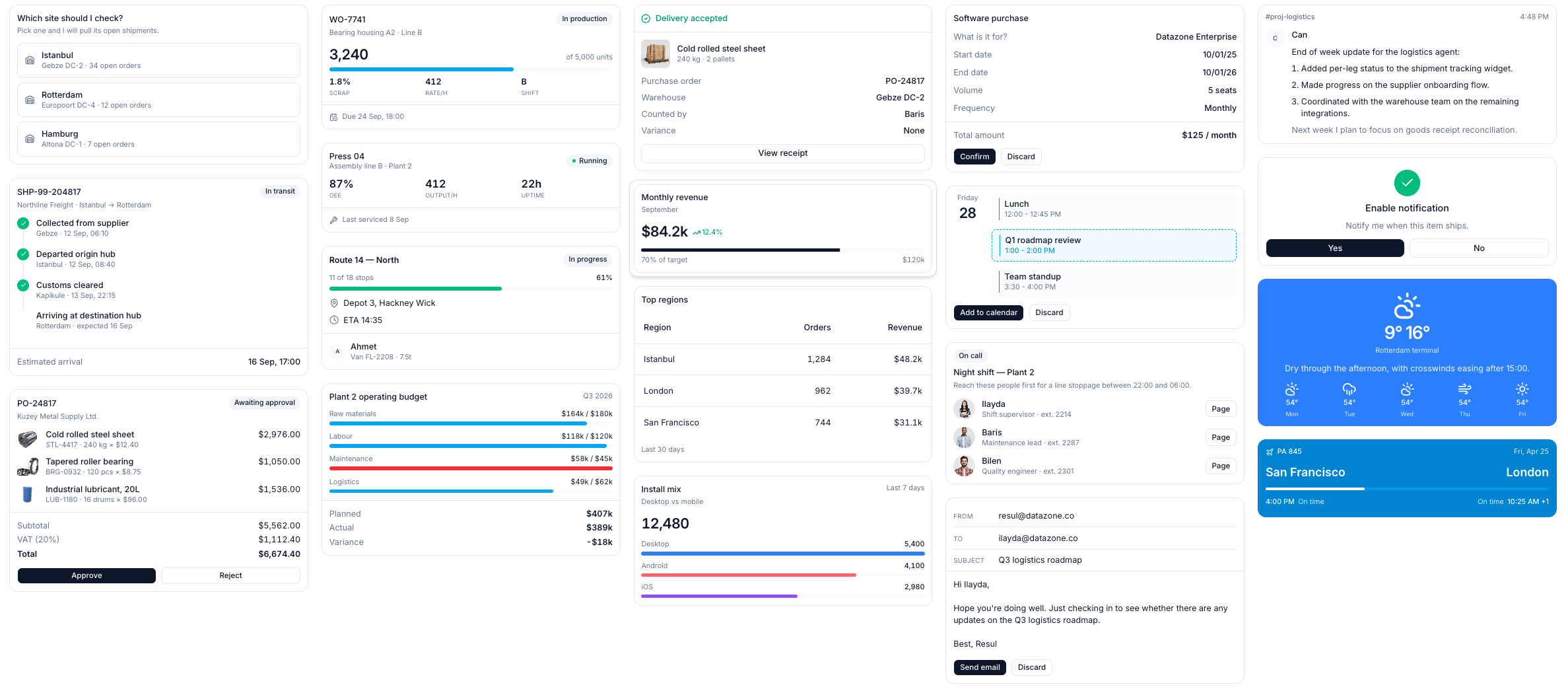
<Frame>
  <img src="https://mintcdn.com/datazone/Vo96BRmTc9lAVpo0/images/light/widget/widget-gallery.png?fit=max&auto=format&n=Vo96BRmTc9lAVpo0&q=85&s=5bf956785d6b7adc11090f2324477df6" alt="Widget gallery" width="2375" height="1046" data-path="images/light/widget/widget-gallery.png" />
</Frame>

## Overview

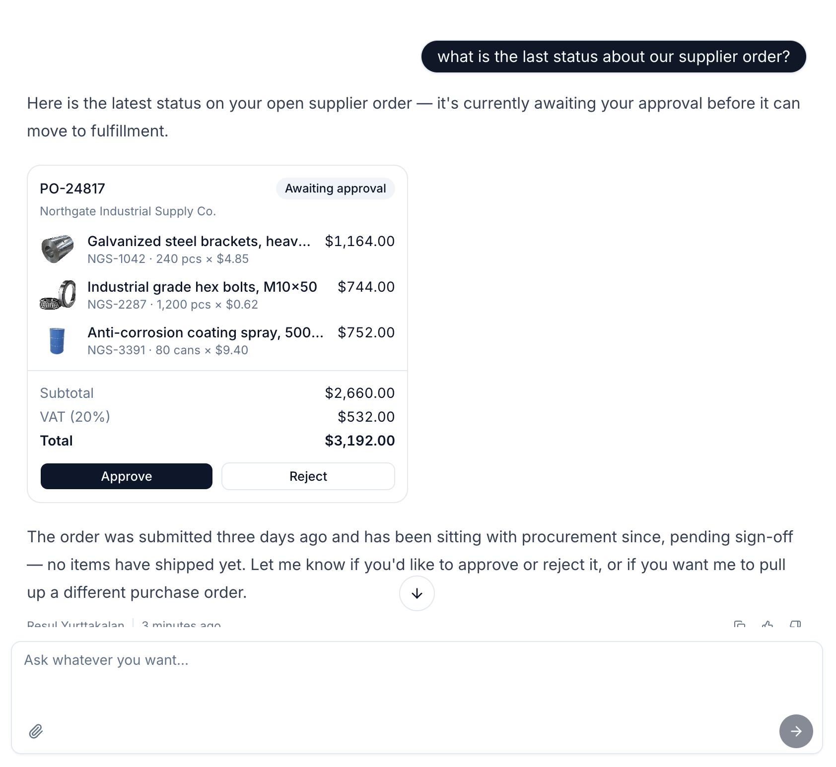
**Widgets** are **React components** that your **agents render inside their answers**. Instead of
describing an order in a paragraph, an agent can show the order — line items, totals and an approve
button — as a component that looks like the rest of your product.

A widget's **only contract is its props**. It has no query, no data fetching and no knowledge of who
renders it: the agent chooses the values, the widget draws them. That keeps widgets small, testable
and reusable across every agent in the project.
<Note>
  Widgets are **project resources**, like actions and endpoints. A widget can only be used by agents
  in the **same project**, and it is declared in `config.yml` and deployed on push.
</Note>

## What a Widget Is Made Of

Every widget is **two files** in your project repository plus **one line in `config.yml`**:

<CodeGroup>
  ```yaml widgets/open_orders_a1b2c3.yml theme={null}
  widget:
    name: open_orders
    title: Open orders
    description: Shows open orders for a site, with a button to drill into one.
    source: widgets/open_orders_a1b2c3.tsx
    props_source: |
      import { z } from "zod"

      const OpenOrdersProps = z.object({
        site: z.string().describe("Which site the orders belong to"),
        orders: z
          .array(
            z.object({
              reference: z.string().describe("Order reference, e.g. PO-24817"),
              supplier: z.string().describe("Who the order is with"),
              amount: z.string().describe("Formatted total, e.g. $6,674.40"),
            })
          )
          .describe("The open orders, newest first"),
      })

      export default OpenOrdersProps
    props:
      type: object
      properties:
        site: { type: string }
        orders: { type: array }
      required: [site, orders]
    default_props:
      site: Gebze DC-2
      orders:
        - reference: PO-24817
          supplier: Kuzey Metal Supply Ltd.
          amount: $6,674.40
  ```

  ```jsx widgets/open_orders_a1b2c3.tsx theme={null}
  import { Badge, Card, CardContent, CardHeader, CardTitle } from "@datazone/widget-sdk"

  export default function OpenOrders({ site, orders }) {
    return (
      <Card size="sm" className="max-w-sm">
        <CardHeader>
          <CardTitle>Open orders</CardTitle>
          <span className="text-xs text-muted-foreground">{site}</span>
        </CardHeader>

        <CardContent className="flex flex-col gap-3">
          {(orders || []).map((order, index) => (
            <div key={index} className="flex items-center justify-between gap-3">
              <div className="flex min-w-0 flex-col">
                <span className="truncate font-medium">{order.reference}</span>
                <span className="truncate text-xs text-muted-foreground">{order.supplier}</span>
              </div>
              <Badge variant="secondary">{order.amount}</Badge>
            </div>
          ))}
        </CardContent>
      </Card>
    )
  }
  ```

  ```yaml config.yml theme={null}
  project_name: my-project
  project_id: proj_abc123
  widgets:
  - path: widgets/open_orders_a1b2c3.yml
  ```
</CodeGroup>

* **Project Structure**

<Tree>
  <Tree.Folder name="my-project" defaultOpen>
    <Tree.File name="config.yml" />

    <Tree.Folder name="widgets" defaultOpen>
      <Tree.File name="open_orders_a1b2c3.yml" />

      <Tree.File name="open_orders_a1b2c3.tsx" />
    </Tree.Folder>
  </Tree.Folder>
</Tree>

### The Declaration

| Field           | What it is                                                                       |
| --------------- | -------------------------------------------------------------------------------- |
| `name`          | Unique within the project. Letters, numbers, dashes and underscores.             |
| `title`         | Human readable name, shown in lists.                                             |
| `description`   | **Shown to the agent.** This is how it decides when the widget is the right one. |
| `source`        | Path to the component file.                                                      |
| `props_source`  | The Zod schema you wrote. Kept so the editor can show it back to you.            |
| `props`         | JSON Schema compiled from `props_source`. **This is what the agent is given.**   |
| `default_props` | Values the preview renders with, and a worked example of the shape.              |

## Creating a Widget

Widgets are authored in the browser, at **Project → Settings → Widgets**. You have three ways to
start:

* **From the gallery** — open **Gallery** for ready-made widgets: purchase orders, shipment
  tracking, work orders, budget plans and more. **Use this template** creates an editable copy in
  your project.
* **From a prompt** — in **New widget**, describe what it should render and **Orion** writes the
  component and its props schema for you.
* **From scratch** — leave the prompt empty and you get a starter component to edit.

The editor gives you the component on the left, its **Schema** and **Default** tabs below, and a
**live preview** on the right that re-renders as you type. Saving commits both files to the branch
you are on and redeploys the project — so what you edit is your repository, not a database row.

<Tip>
  **Go to source code** in the editor header opens the widget's YAML in the **Code** tab, on the same
  branch.
</Tip>

## The Widget SDK

A widget imports its components from **`@datazone/widget-sdk`**:

```jsx theme={null}
import { Badge, Button, Card, CardContent, Icon } from "@datazone/widget-sdk"
```

Available components:

|             |                                                                                                |
| ----------- | ---------------------------------------------------------------------------------------------- |
| **Layout**  | `Card`, `CardHeader`, `CardTitle`, `CardDescription`, `CardContent`, `CardFooter`, `Separator` |
| **Content** | `Badge`, `Button`, `Progress`, `Skeleton`, `Icon`                                              |
| **People**  | `Avatar`, `AvatarImage`, `AvatarFallback`                                                      |
| **Tables**  | `Table`, `TableHeader`, `TableHead`, `TableBody`, `TableRow`, `TableCell`                      |

`Icon` renders **any Lucide icon by name** — `<Icon name="package" className="size-4" />` — so you
never need icon imports of your own.

Styling is **Tailwind classes**, the same ones the product uses, which is what keeps widgets looking
like Datazone.

<Warning>
  The SDK is **deliberately closed**. A widget cannot import from npm, reach the network, or touch
  the platform's data layer — it renders the props it is given, and nothing else. Anything a widget
  should display has to arrive as a prop.
</Warning>

<Note>
  Stick to **common Tailwind utilities**. Styles are generated when the product is built, and your
  widget's source is not part of that build — a very unusual utility class may simply have no effect.
  For dynamic values such as a bar width, use an inline `style` instead of an arbitrary class.
</Note>

## Props and the Schema

You write the props schema in **Zod**, and Datazone compiles it to **JSON Schema** — the format the
agent is given, the same one tool calling uses.

```ts theme={null}
import { z } from "zod"

const OpenOrdersProps = z.object({
  site: z.string().describe("Which site the orders belong to"),
  orders: z.array(Order).describe("The open orders, newest first"),
})

export default OpenOrdersProps
```

Two rules:

* The schema file must **`export default`** a Zod schema.
* **Use `.describe()` on every field.** The descriptions travel to the agent and are the main thing
  it has to go on when choosing values. A schema without them still validates, but the agent guesses.

Props the agent sends are **validated before rendering**. If they do not satisfy the schema, the
user sees an error instead of a broken component.

## Letting an Agent Use It

A widget is not available to an agent until you **allow it**, under **Agent → Widgets**. Only
widgets from the **same project** can be allowed.

Once allowed, the agent is told the widget's id, description and props schema, and renders one by
emitting a fenced block in its answer:

````
```widget
{"widget_id": "6512f1a9c4b2e8d3a7f09b14", "props": {"site": "Gebze DC-2", "orders": []}}
```
````

You never write that block yourself — the agent does, and Datazone replaces it with the rendered
component. The allowlist is enforced on the server, so an agent cannot render a widget it was not
given, and an embedded viewer never needs widget permissions of their own.

## Interactive Widgets

A widget can **answer back**. Give any `Button` an `onClickAction` and clicking it sends a message
to the conversation as if the user had typed it:

```jsx theme={null}
import { Button, Card, CardContent, CardHeader, CardTitle } from "@datazone/widget-sdk"

export default function SitePicker({ title, options }) {
  return (
    <Card size="sm" className="max-w-sm">
      <CardHeader>
        <CardTitle>{title}</CardTitle>
      </CardHeader>
      <CardContent className="flex flex-col gap-2">
        {(options || []).map((option, index) => (
          <Button
            key={index}
            variant="outline"
            className="w-full justify-start"
            onClickAction={{ type: "send_message", message: option }}
          >
            {option}
          </Button>
        ))}
      </CardContent>
    </Card>
  )
}
```

Ask *"which site should I check?"*, show three sites, and the user picks one instead of typing it.
The agent receives `"Rotterdam"` as the next message and carries on.

<Frame>
  <img src="https://mintcdn.com/datazone/Vo96BRmTc9lAVpo0/images/light/widget/widget-usage-in-agent.png?fit=max&auto=format&n=Vo96BRmTc9lAVpo0&q=85&s=05928941336e9c0db29aa2d4108d25d3" alt="A widget rendered inside an agent answer" width="1684" height="1546" data-path="images/light/widget/widget-usage-in-agent.png" />
</Frame>

<Note>
  `send_message` sends **only text**, and only what the widget declares — nothing a user could not
  have typed themselves. Buttons disable themselves while an answer is still streaming, so a click
  cannot queue a second question.
</Note>

## Branches

Widgets are **branch-aware**, like every other project resource. A widget exists on the branches it
has been deployed to, and each branch holds its own version of the component and the declaration.
The branch selector on the widget list and in the editor decides which one you are looking at.

## Good to Know

* **Widgets render in the viewer's browser.** Widget code is written by your team and runs for
  everyone who talks to the agent, including anonymous users of an embedded agent. Review widget
  source the way you review any other code you ship to a browser.
* **Keep them presentational.** A widget that needs data should receive it as props — from the
  agent, or from a tool the agent called first.
* **Default props are a worked example.** They render the preview, and they show the agent the shape
  you expect.
